Chapter 3 Regression Analysis
3.0.1 Linear Regression
- Create a linear model of the time series dataset.
- Show the summary of the model and explain the outcome.
- Create a plot of the linear model on top of the time series dataset line plot with scatter data points.
- Perform residual analysis and create a line & scatter plot of the residuals. Explain the outcome.
- Create a histogram plot of the residuals. Explain the outcome.
- Create ACF & PACF plots of residuals. Explain the outcome.
- Create QQ plot of residuals. Explain the outcome.
- Perform Shapiro-Wilk test on residuals. Explain the outcome.
- Explain if linear model is appropriate or not.
3.0.1.1 Create a linear model of the time series dataset.
# Convert Date to numeric format for linear modeling
BitCoin_df <- BitCoin_df %>%
mutate(Date_numeric = as.numeric(Date))

# Fit the linear model
linear_model <- lm(Close ~ Date_numeric, data = BitCoin_df)
#y=mx+c
#close price = m*numeric date + c
Code explanation here The linear model predicts Bitcoin’s closing price based on the date. The slope shows the price change rate over time, and the intercept represents the initial price at the start date.
3.0.1.2 Show the summary of the model and explain the outcome.
##
## Call:
## lm(formula = Close ~ Date_numeric, data = BitCoin_df)
##
## Residuals:
##    Min     1Q Median     3Q    Max
## -15114  -7997  -2255   3065  35626
##
## Coefficients:
##                Estimate Std. Error t value Pr(>|t|)
## (Intercept)  -2.211e+05  1.939e+04  -11.40   <2e-16 ***
## Date_numeric  1.308e+01  1.073e+00   12.19   <2e-16 ***
## ---
## Signif. codes:  0 '***' 0.001 '**' 0.01 '*' 0.05 '.' 0.1 ' ' 1
##
## Residual standard error: 10430 on 105 degrees of freedom
## Multiple R-squared:  0.586,  Adjusted R-squared:  0.5821
## F-statistic: 148.6 on 1 and 105 DF,  p-value: < 2.2e-16
In Summary
- The model indicates a statistically significant relationship between the date and the closing price of Bitcoin, as shown by the very small p-value (< 2.2e-16).
- The date explains about 58.6% of the variation in closing prices, as reflected by the Multiple R-squared and Adjusted R-squared values.
- The average prediction error is approximately 10430, as indicated by the Residual Standard Error.
- For each unit increase in the numeric date, the closing price of Bitcoin rises by about 13.08 units, which is determined by the slope of the regression line.
# Create a new column with fitted values
BitCoin_df <- BitCoin_df %>%
mutate(Fitted_Close = predict(linear_model))

# Plot the original data and the linear model

ggplot(BitCoin_df, aes(x = Date)) +
geom_point(aes(y = Close, color = "Original Data")) +  # Original data points
geom_line(aes(y = Fitted_Close, color = "Fitted Line")) +  # Fitted line
labs(title = "Linear Model of Bitcoin Prices Over Time",
     x = "Date",
     y = "Close Price",
     color = "Legend") +  # Add a label to the legend
theme_minimal() +
scale_color_manual(values = c("Original Data" = "blue", "Fitted Line" = "red"))  # Specify colors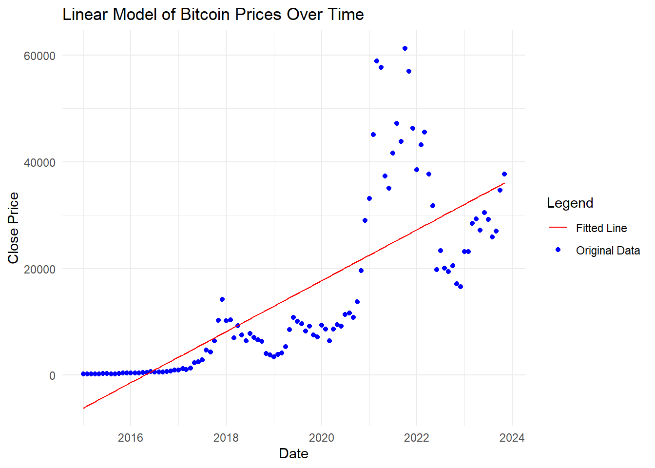
Code explanation here
The provided graph and summary show a linear regression model of Bitcoin prices over time. The blue points represent the original data, while the red line represents the fitted linear model.
3.0.1.3 Create a plot of the linear model on top of the time series dataset line plot with scatter data points.
#Create a plot of the linear model on top of the time series dataset line plot with scatter data points.

#Plot the original data, the time series line, and the linear model
ggplot(BitCoin_df, aes(x = Date)) +
geom_point(aes(y = Close), color = "blue") +  # Original data points
geom_line(aes(y = Close), color = "blue", linetype = "dashed") +  # Time series line
geom_line(aes(y = Fitted_Close), color = "red") +  # Fitted linear model line
labs(title = "Time Series of Bitcoin Prices with Linear Model",
     x = "Date",
     y = "Close Price") +
theme_minimal() 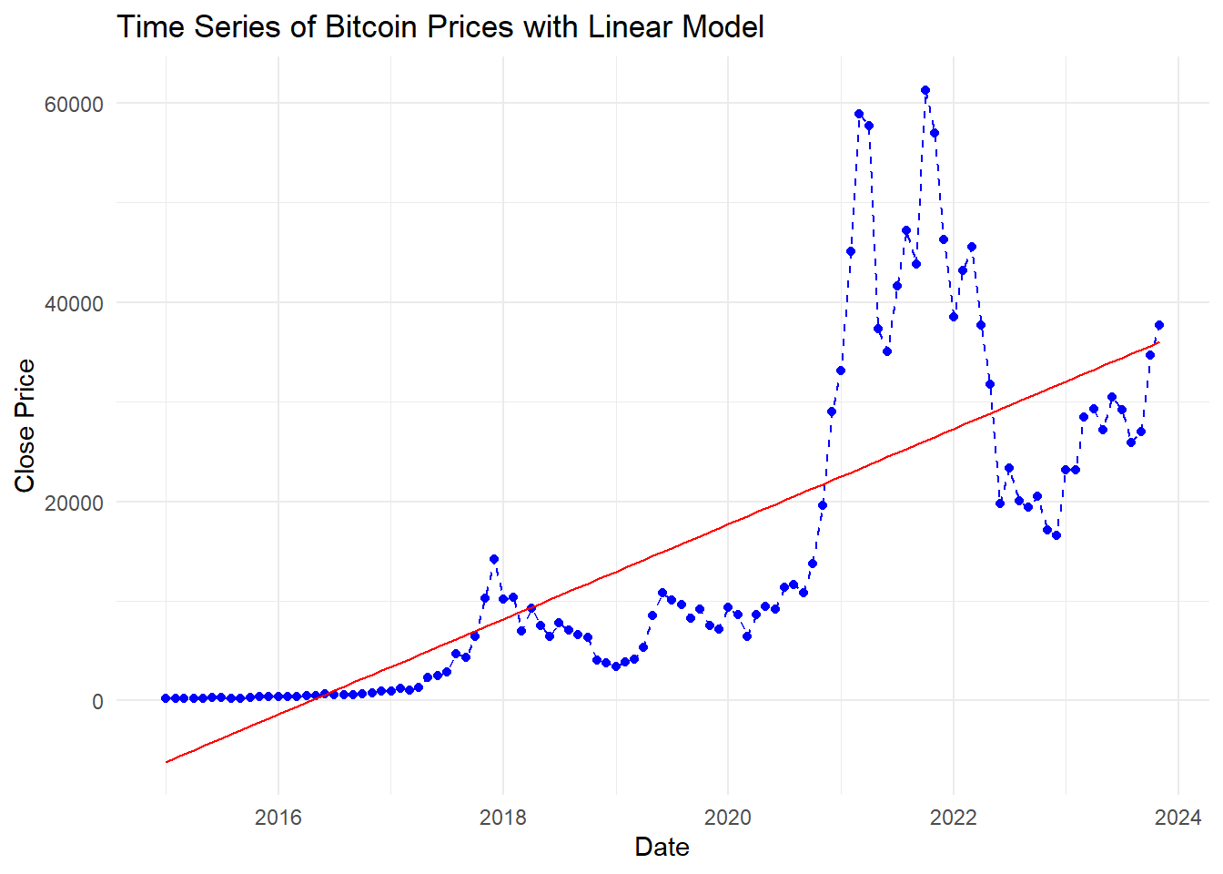
Code explanation here The graph shows Bitcoin prices over time with blue dots representing the original data points and a blue dashed line representing the time series trend. The red line indicates the fitted linear model. The linear model captures the general upward trend but misses some of the more volatile fluctuations in Bitcoin prices.
3.0.1.4 Perform residual analysis
#Calculate residuals
BitCoin_df <- BitCoin_df %>%
mutate(Residuals = Close - Fitted_Close)

#residual calcultion in different way
#res_dual_values <- residuals(linear_model)
#summary(res_dual_values)
Code explanation here
Residuals are calculated to assess model fit. The dataset includes date, closing price, month, year, numeric date, fitted close values, and residuals for verification.
3.0.1.5 Perform residual analysis and create a line & scatter plot of the
# Plot the residuals: Line plot
ggplot(BitCoin_df, aes(x = Date, y = Residuals)) +
  geom_line(color = "blue") +
  labs(title = "Line Plot of Residuals over Time",
       x = "Date",
       y = "Residuals") +
  theme_minimal()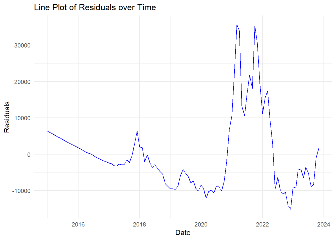
Code explanation here The graph shows a blue line plotting the difference between actual values and predicted values for a Bitcoin data set, over time. Basically, it shows how much the actual Bitcoin values differed from what a model predicted on certain dates.
3.0.1.6 Residual analysis scatter plot
# Plot the residuals: Scatter plot
ggplot(BitCoin_df, aes(x = Fitted_Close, y = Residuals)) +
  geom_point(color = "blue") +
  geom_hline(yintercept = 0, linetype = "dashed", color = "red") +
  labs(title = "Scatter Plot of Residuals",
       x = "Fitted Close Price",
       y = "Residuals") +
  theme_minimal()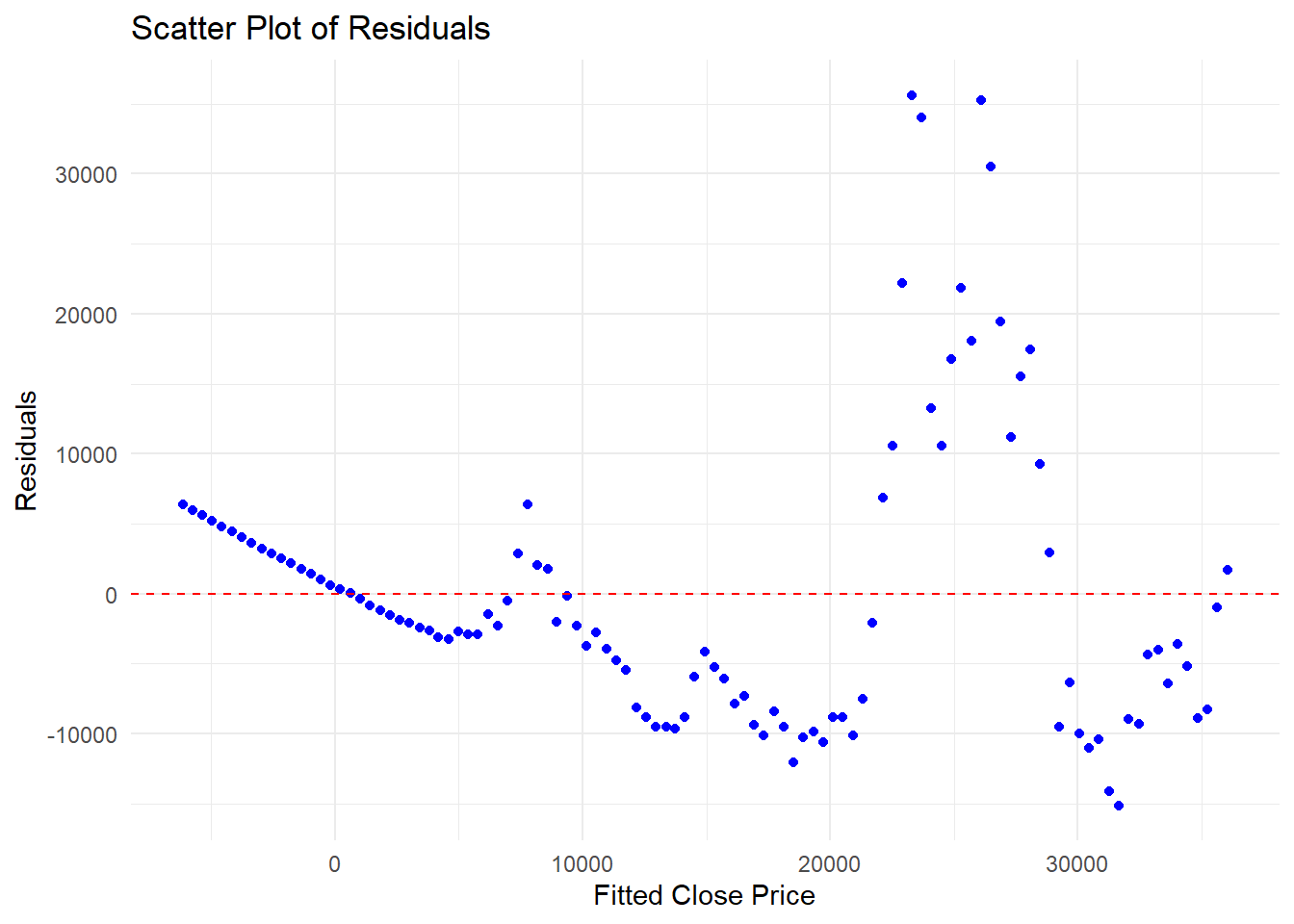
Code explanation here
This graph shows blue dots representing the difference between actual Bitcoin closing prices and what a model predicted. The horizontal red line represents perfect predictions (no difference). Scattered points around the line indicate the model’s accuracy - ideally, the dots would be random with no clear pattern.
3.0.1.7 Summary of Residual analysis
##    Min. 1st Qu.  Median    Mean 3rd Qu.    Max.
##  -15114   -7997   -2255       0    3065   35626
Code explanation here
The summary statistics of the residuals provide insight into the accuracy of the linear model’s predictions for Bitcoin closing prices. The residuals range from -15,114 to 35,626, indicating the model sometimes significantly underestimates or overestimates the actual prices. The median residual of -2,255 suggests that half of the predictions are off by less than this amount. The mean residual is 0, indicating that, on average, the model’s predictions are unbiased. The first and third quartiles (-7,997 and 3,065) show that 50% of the residuals fall within this range, highlighting the variability in prediction accuracy.
3.0.1.8 Create a histogram plot of the residuals. Explain the outcome.
#Create a histogram plot of the residuals. Explain the outcome.
  # Plot the histogram of residuals
  ggplot(BitCoin_df, aes(x = Residuals)) +
  geom_histogram(binwidth = 500, color = "black", fill = "blue", alpha = 0.7) +
  labs(title = "Histogram of Residuals",
       x = "Residuals",
       y = "Frequency") +
  theme_minimal()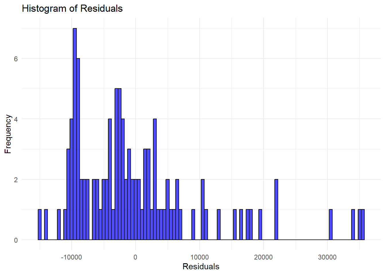
Code explanation here
Ideally, the residuals should be normally distributed (bell-shaped curve centered around zero). The histogram here shows some deviation from normality, indicating that the model may not perfectly capture the data distribution.
3.0.1.9 Create a histogram plot of the residuals with
# Overlay a normal distribution curve on the histogram
ggplot(BitCoin_df, aes(x = Residuals)) +
  geom_histogram(aes(y = ..density..), binwidth = 500, color = "black", fill = "blue", alpha = 0.7) +
  stat_function(fun = dnorm, args = list(mean = mean(BitCoin_df$Residuals), sd = sd(BitCoin_df$Residuals)), color = "red", size = 1) +
  labs(title = "Histogram of Residuals with Normal Curve",
       x = "Residuals",
       y = "Density") +
  theme_minimal()
## Warning: Using `size` aesthetic for lines was
## deprecated in ggplot2 3.4.0.
## ℹ Please use `linewidth` instead.
## This warning is displayed once every 8
## hours.
## Call
## `lifecycle::last_lifecycle_warnings()`
## to see where this warning was
## generated.## Warning: The dot-dot notation (`..density..`)
## was deprecated in ggplot2 3.4.0.
## ℹ Please use `after_stat(density)`
## instead.
## This warning is displayed once every 8
## hours.
## Call
## `lifecycle::last_lifecycle_warnings()`
## to see where this warning was
## generated.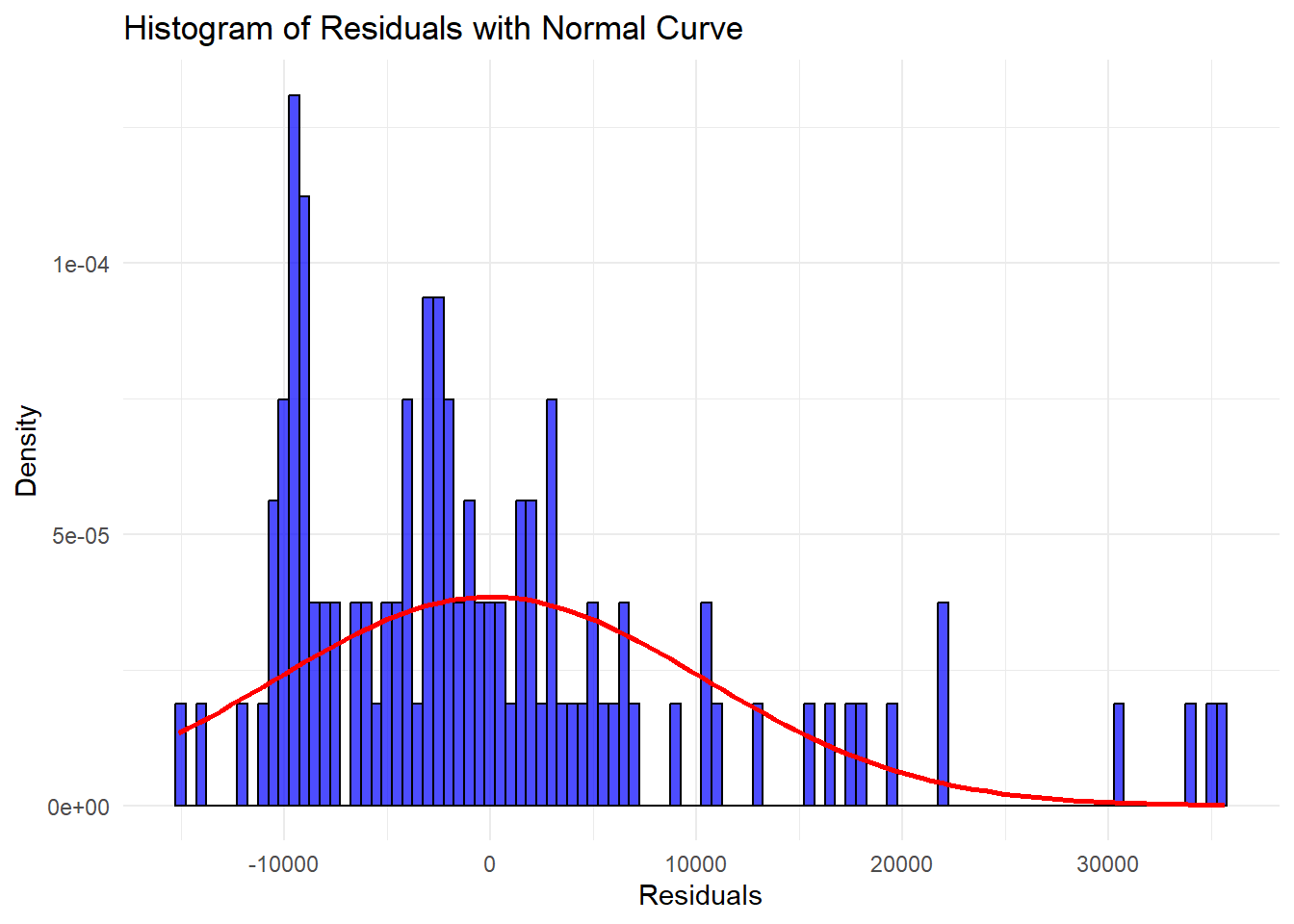
code explanation here
This graph shows a histogram of prediction errors (residuals) for Bitcoin prices with a normal distribution curve overlaid in red. The bars represent the frequency of errors in different price ranges. Ideally, the bars would closely match the smooth red curve, indicating the errors follow a normal distribution. By comparing their shapes, we can assess how close the actual errors are to being normally distributed.
3.0.1.10 Create ACF & PACF plots of residuals.Explain the outcome.
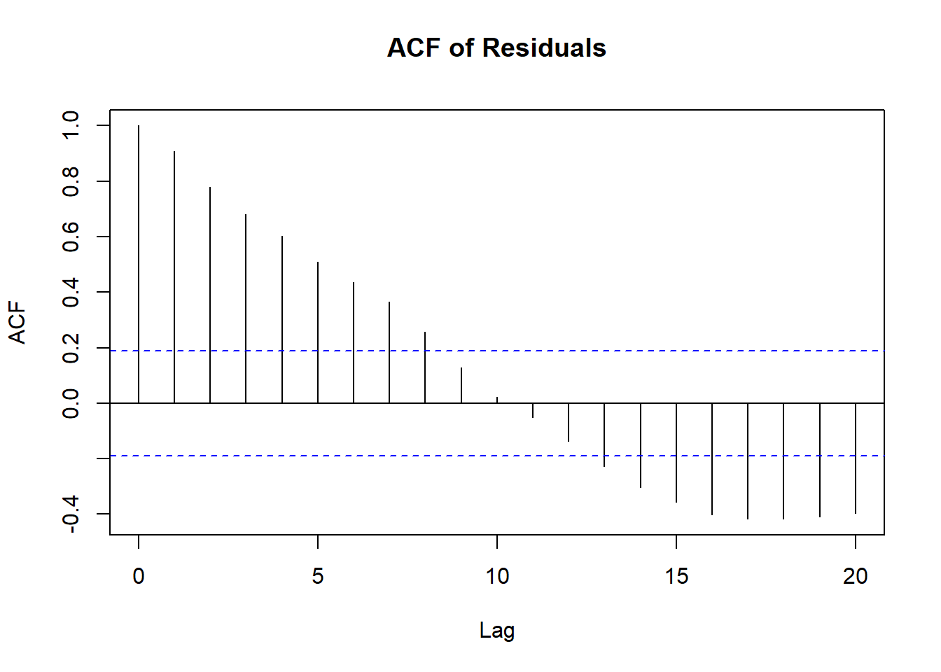
Code explanation here In this plot, the residuals have significant autocorrelations up to around lag 5. This suggests that the residuals are not purely random and that there is some pattern left unexplained by the model.
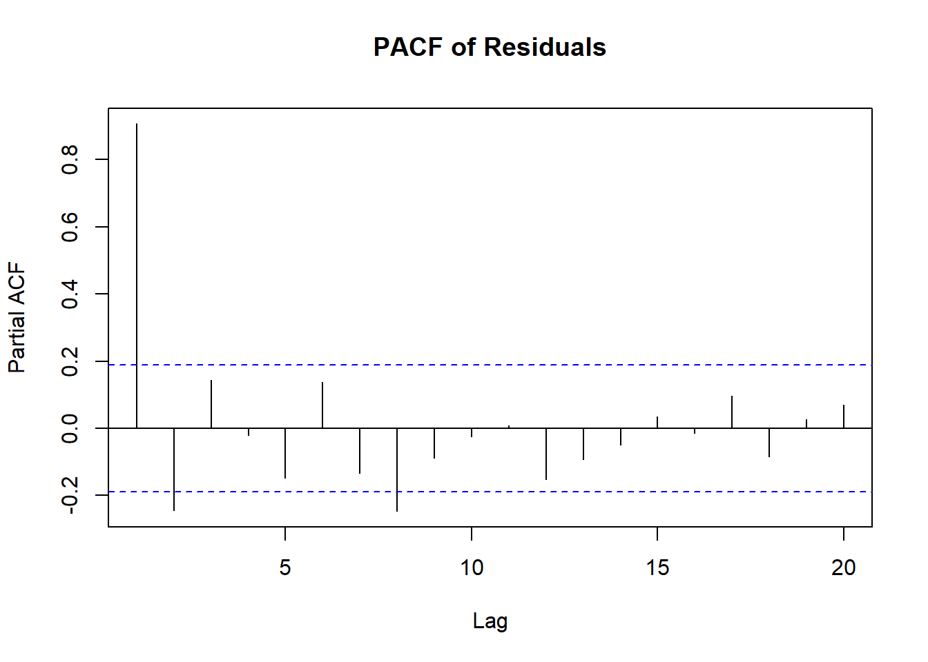
In a well-fitted model, the PACF should show no significant partial autocorrelation beyond the first few lags. This plot shows a significant partial autocorrelation at lag 1 and some minor significant lags afterward, suggesting that there might be some remaining structure in the residuals.
These analyses suggest that the linear regression model may not be the best fit for this time series data, and a more complex model may be needed to better capture the underlying patterns and trends in Bitcoin prices.
3.0.1.11 Create QQ plot of residuals. Explain the outcome.
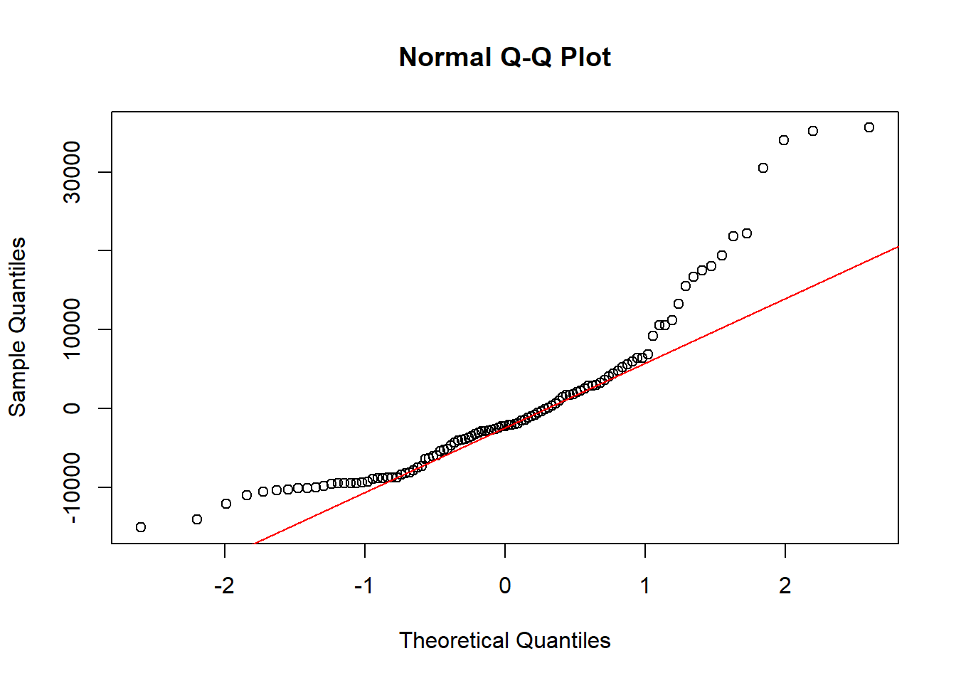
Code explanation here
- The residuals do not follow a normal distribution, as indicated by the significant deviations in the tails.
- Since many statistical methods (like linear regression) assume normally distributed residuals, the non-normality observed here indicates that the model assumptions are violated.
3.0.1.12 Perform Shapiro-Wilk test on residuals. Explain the outcome.
#Perform Shapiro-Wilk test on residuals. Explain the outcome.

# Perform Shapiro-Wilk test on residuals
shapiro_test <- shapiro.test(BitCoin_df$Residuals)

# Print the result of the Shapiro-Wilk test
print(shapiro_test)
##
## Shapiro-Wilk normality test
##
## data: BitCoin_df$Residuals
## W = 0.85983, p-value = 1.215e-08Code explanation here
The Shapiro-Wilk test assesses the normality of residuals. The test statistic 𝑊 W is 0.85983, and the p-value is 1.215e-08, which is much less than 0.05. This indicates that the residuals are not normally distributed,
3.0.1.13 Explain if linear model is appropriate or not.
Code explanation here The linear regression model is not a suitable choice for Bitcoin price forecasting. The model explains about 58.6% of the variation in closing Bitcoin prices, as indicated by the Multiple R-squared and Adjusted R-squared values of Linear Model.
With some Residual Analysis we also get same indication:
ACF test of Residuals:
- The ACF plot of residuals shows significant autocorrelations up to around lag 5. This suggests that the residuals are not purely random and that some patterns remain unexplained by the model.
PACF test of Residuals:
- In a well-fitted model, the PACF should show no significant partial autocorrelation beyond the first few lags. -The PACF plot shows a significant partial autocorrelation at lag 1 and some minor significant lags afterward, indicating remaining structure in the residuals.
QQ Plot: -The QQ plot reveals that the residuals do not follow a normal distribution, as evidenced by significant deviations in the tails.
Shapiro-Wilk Test:
- The Shapiro-Wilk test yields a p-value of 1.215e-08, indicating that the residuals are not normally distributed.
The residuals exhibit significant autocorrelation and non-normality, confirming that the linear regression model is not capturing all the patterns in the data.
3.0.2 Quadratic Regression
- Create a quadratic model of the time series dataset.
- Show the summary of the model and explain the outcome.
- Explain if quadratic model is appropriate or not.
3.0.2.1 Create a quadratic model of the time series dataset
# Create the quadratic term for the date
BitCoin_df <- BitCoin_df %>%
  mutate(Date_numeric = as.numeric(Date),
         Date_numeric2 = Date_numeric^2)
view(BitCoin_df)
# Fit the quadratic model
quadratic_model <- lm(Close ~ Date_numeric + Date_numeric2, data = BitCoin_df)
Code explanation here
The dataset is enhanced by adding a squared numeric date column to capture non-linear trends. A quadratic regression model is then fitted with closing price as the dependent variable and both the numeric date and its square as independent variables. This model aims to better capture the relationship between time and Bitcoin closing prices by accounting for potential quadratic effects.
3.0.2.2 Show the summary of the model and explain the outcome.
##
## Call:
## lm(formula = Close ~ Date_numeric + Date_numeric2, data = BitCoin_df)
##
## Residuals:
##    Min     1Q Median     3Q    Max
## -15872  -7420  -1996   2666  36106
##
## Coefficients:
##                 Estimate Std. Error t value Pr(>|t|)
## (Intercept)    1.066e+05  4.157e+05   0.256    0.798
## Date_numeric  -2.333e+01  4.615e+01  -0.506    0.614
## Date_numeric2  1.009e-03  1.278e-03   0.789    0.432
##
## Residual standard error: 10450 on 104 degrees of freedom
## Multiple R-squared:  0.5885, Adjusted R-squared:  0.5806
## F-statistic: 74.36 on 2 and 104 DF,  p-value: < 2.2e-16
Code explanation here
- Coefficients:
- the coefficients for Date_numeric and Date_numeric^2 are not statistically significant (p-values > 0.05). This suggests that neither the linear nor the quadratic term significantly predicts the closing price of Bitcoin. Model Fit:
- The R-squared value of 0.5885 indicates that the model explains about 58.85% of the variance in Bitcoin’s closing prices. This is a moderate level of explanation. The significant F-statistic indicates that the model as a whole is statistically significant, even though individual predictors are not.
In the context of financial markets and Bitcoin price forecasting, a model explaining 58% of the variance can be seen as relatively decent, given the high volatility and complexity of financial data.
3.0.2.3 Explain if quadratic model is appropriate or not.
# Create a new column with the fitted values from the quadratic model
BitCoin_df <- BitCoin_df %>%
  mutate(Fitted_Close_Quadratic = predict(quadratic_model))

# Plot the original data, the linear model, and the quadratic model
ggplot(BitCoin_df, aes(x = Date)) +
  geom_point(aes(y = Close), color = "blue") +  # Original data points
  geom_line(aes(y = Fitted_Close), color = "red", linetype = "dashed") +  # Fitted linear model line
  geom_line(aes(y = Fitted_Close_Quadratic), color = "green") +  # Fitted quadratic model line
  labs(title = "Time Series of Bitcoin Prices with Linear and Quadratic Models",
       x = "Date",
       y = "Close Price") +
  theme_minimal()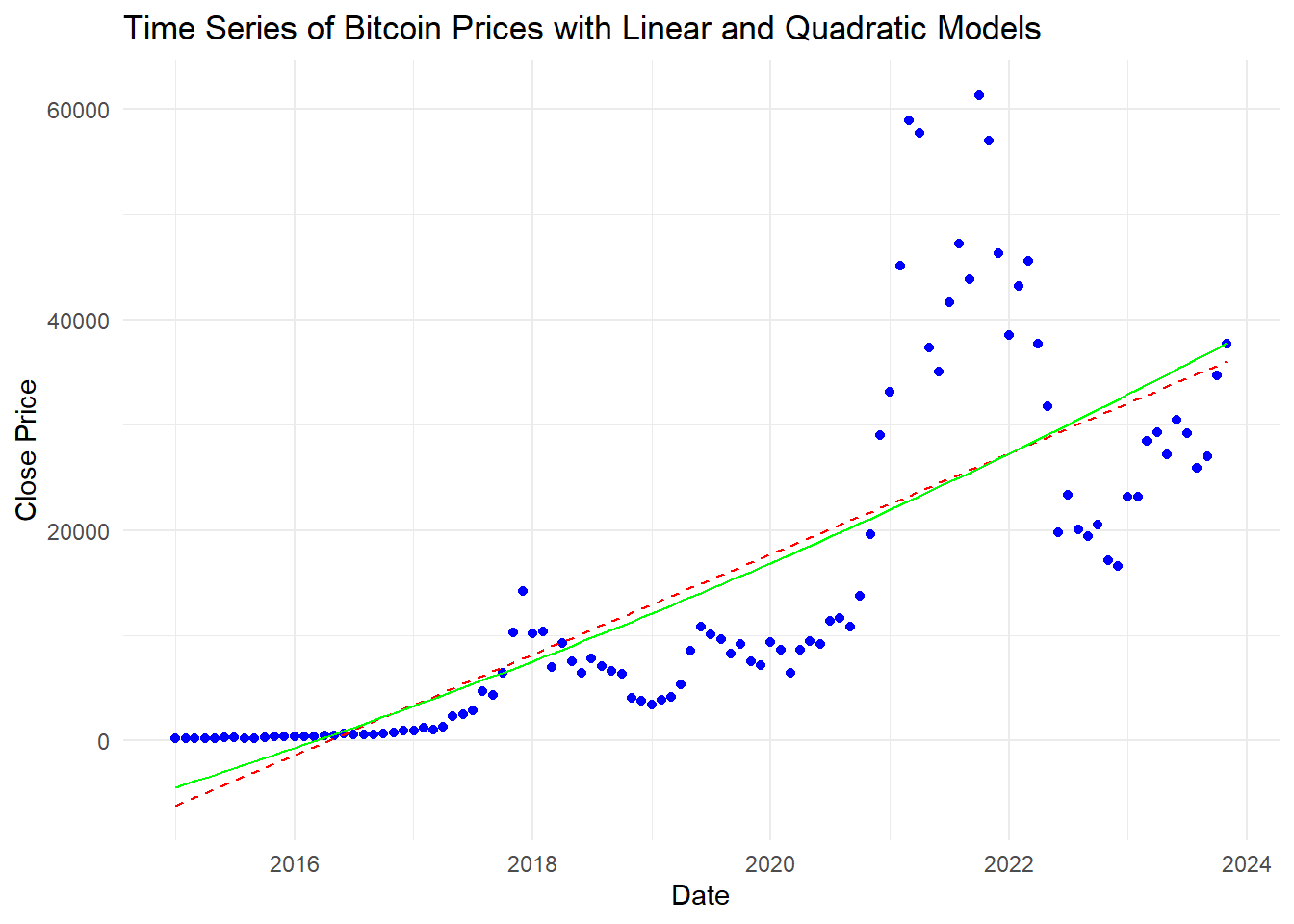
##    Min. 1st Qu.  Median    Mean 3rd Qu.    Max.
##   -4411    4156   14045   14944   25262   37777
Code explanation here
The quadratic model shows some ability to explain the variance in Bitcoin’s closing prices, but the lack of significance in the individual coefficients suggests that it might not be the best fit. Additional predictors or a different modeling approach (e.g., non-linear models, time series models) might be needed to better capture the underlying patterns in the data.